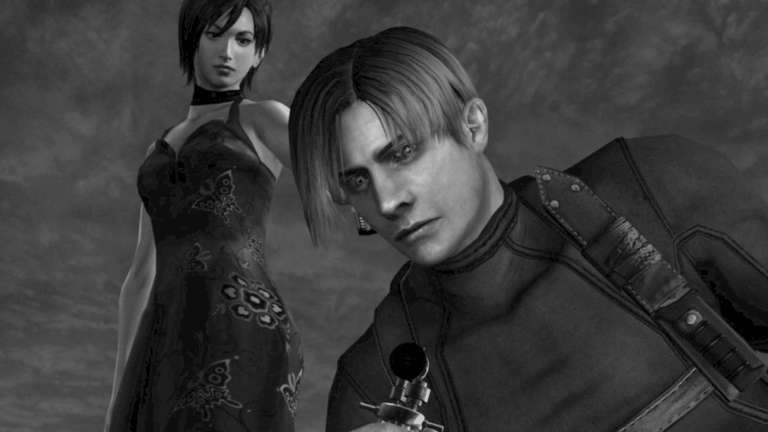
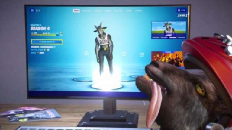
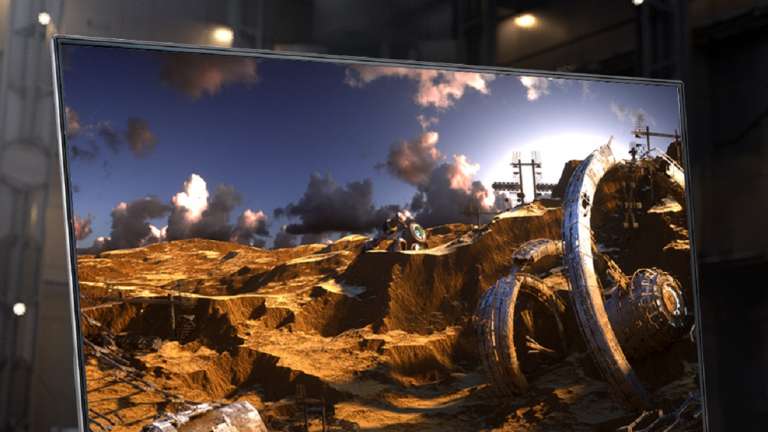
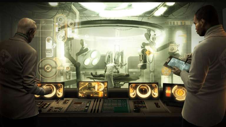
Playing Call of Duty: Modern Warfare 2, like most other multiplayer first-person shooter games, is not overly complicated. You aim for a player not on your team with the opposite end of the shooty stick and cross your fingers that you will kill them before they kill you. Considering how easy it is, it baffles me that I still need to become an expert in this. In addition, the gameplay and control structure of the series has remained consistent over the years, making it easy for long-time fans to take up newer entries. On the other hand, the most challenging aspect of the freshly released addition is navigating the user interface for the menus. The user interface for the menus in Modern Warfare 2 was completely redesigned, which was one of the most significant new features. Infinity Ward decided to make some changes, most likely to provide gamers with a modern and user-friendly interface that is simple to browse and provides you with everything you require as quickly as it can. Unfortunately, Infinity Ward failed to hit the target, much like when I accidentally threw a grenade at my team. The user interface for the menu features a menu segment track at the top, much like the user interfaces of many other games; however, after you select one of these sections, things become somewhat dull. According to GamesRadar, the game modes are presented to players in the form of huge icons rather than short lists, which makes it more difficult for players to locate the way of their choosing promptly. In addition, the photographs themselves are pretty generic, which makes the search more difficult rather than easier. According to GamesRadar, the reason why it appears to be the menu of a streaming platform is likely because UI designers from Hulu were involved in its development.
Playing Call of Duty: Modern Warfare 2, like most other multiplayer first-person shooter games, is not overly complicated. You aim for a player not on your team with the opposite end of the shooty stick and cross your fingers that you will kill them before they kill you. Considering how easy it is, it baffles me that I still need to become an expert in this. In addition, the gameplay and control structure of the series has remained consistent over the years, making it easy for long-time fans to take up newer entries. On the other hand, the most challenging aspect of the freshly released addition is navigating the user interface for the menus. The user interface for the menus in Modern Warfare 2 was completely redesigned, which was one of the most significant new features. Infinity Ward decided to make some changes, most likely to provide gamers with a modern and user-friendly interface that is simple to browse and provides you with everything you require as quickly as it can. Unfortunately, Infinity Ward failed to hit the target, much like when I accidentally threw a grenade at my team. The user interface for the menu features a menu segment track at the top, much like the user interfaces of many other games; however, after you select one of these sections, things become somewhat dull. According to GamesRadar, the game modes are presented to players in the form of huge icons rather than short lists, which makes it more difficult for players to locate the way of their choosing promptly. In addition, the photographs themselves are pretty generic, which makes the search more difficult rather than easier. According to GamesRadar, the reason why it appears to be the menu of a streaming platform is likely because UI designers from Hulu were involved in its development.

![Mortal Kombat Komplete Edition Steam Key (PC Steam Key) [ROW]](https://happygamer.com/wp-content/uploads/2023/10/1ea06c9f0f51a3fe339606df478a3bb7.png)