Sometimes the smallest details make the biggest difference. That’s exactly what’s happening in the Overwatch community right now, where a simple complaint about portrait designs has blown up into a massive discussion about what makes good UI.
A Reddit post that’s been getting tons of attention perfectly captures what many of us have been feeling about Overwatch 2’s visual design. It’s not about gameplay mechanics or hero balance this time. It’s about something we see every single match but rarely talk about — those little portrait frames around our heroes.
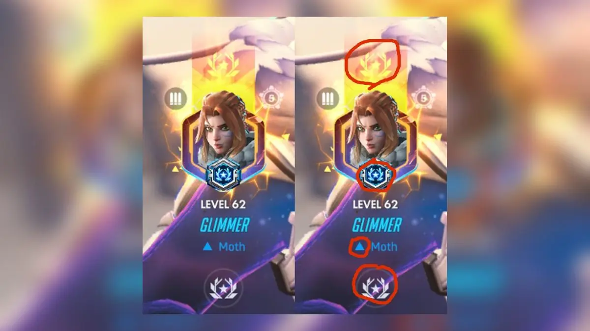
“Overwatch portraits are WAY over-designed. It’s just my opinion but I prefer Overwatch 1 borders with stars underneath, it was SO much simpler and cleaner. This new version is absurdly overdesigned. You don’t need the wreathed stars above and below everything. You don’t need a third wreathed star just below the hero if you’re also going to have a separate, colored portrait around the hero picture itself too(the one with triangles and lightning). You don’t need separate tier icons and tier-colors for titles themselves. Am I crazy here?” — u/glimmerware on r/Overwatch
The post has racked up over 3,470 engagements, which tells us this isn’t just one person’s nitpick. It’s hitting something a lot of players feel but maybe couldn’t put into words.
Let’s break down what they’re talking about. In Overwatch 1, your rank and portrait were clean and simple. You had your hero picture, maybe some stars underneath to show your level, and that was it. Easy to read, easy to understand.
Now? We’ve got wreathed stars above and below everything. There’s a third star design just below your hero portrait. Plus there’s this whole separate colored frame around your hero picture with triangles and lightning effects. And on top of all that, we still have separate tier icons AND tier colors for competitive ranks.
It’s like when someone goes overboard decorating their house for the holidays. Each individual element might look cool, but put them all together and it becomes visual noise.
This complaint taps into something bigger that we’ve been dealing with since Overwatch 2 launched. The game has this constant need to show us more information, more visual flair, more everything. But sometimes more isn’t better.
We see this pattern everywhere in modern game design. Developers want to show progression, achievement, status — all good things. But they pile on so many visual elements that the important stuff gets lost in the clutter. When you’re trying to quickly check someone’s rank in the middle of a match, you don’t want to decode a puzzle of stars and frames and colors.
The original Overwatch got this right. Those simple portrait borders weren’t just cleaner — they were functional. You could glance at someone’s portrait and instantly know what you needed to know. No mental processing required.
It’s not just about nostalgia either. Good UI design has principles, and one of the biggest ones is keeping things simple. Every extra visual element should serve a purpose. If you can communicate the same information with fewer elements, that’s almost always the better choice.
The community response to this post shows how much we value clarity over complexity. We want our game interfaces to be tools, not art projects. When we’re in the middle of an intense team fight, we need information fast and clear.
This also reflects a broader tension between Overwatch 1 and 2. The sequel changed a lot more than just the roster and game modes. It changed the visual language of the entire game. Some of those changes work great, but others feel like change for change’s sake.
Blizzard has been pretty good about listening to community feedback on major gameplay issues. We’ve seen hero reworks, balance changes, and even map adjustments based on what players ask for. The question is whether they’ll pay attention to seemingly smaller issues like UI design.
The thing is, UI isn’t actually small. It’s something we interact with constantly. Bad UI can make a good game feel clunky. Good UI disappears and lets you focus on what matters — the gameplay.
Will Blizzard simplify the portrait system? It’s hard to say. UI changes are often seen as low priority compared to hero balance or new content. But with this much community attention, maybe they’ll take a second look.
For now, we’re stuck with our over-decorated portraits. But at least we know we’re not alone in missing the clean, simple design of Overwatch 1. Sometimes the best approach is the one that doesn’t try so hard to impress you.
The discussion around this post proves that good game design isn’t just about the big flashy features. It’s about all the little details that make playing feel smooth and natural. And right now, our portraits are anything but simple.